Client
Mary's Kitchen
Project
Visual Identity
Deliverables
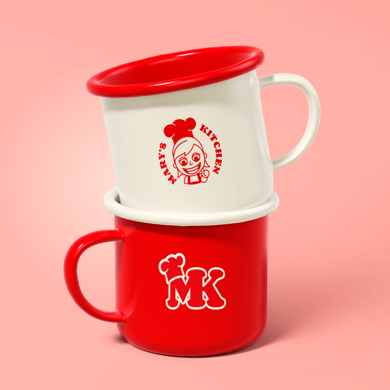
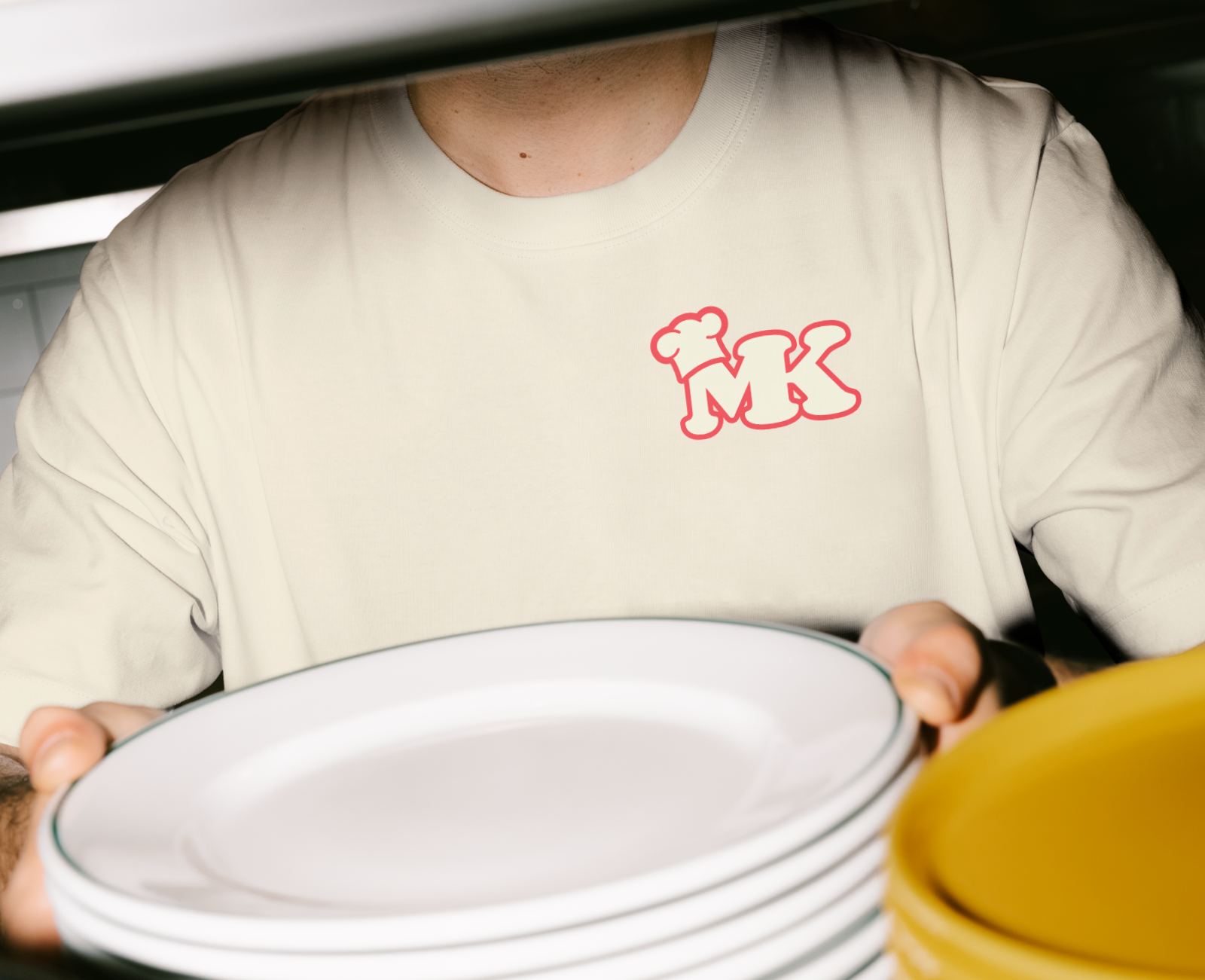
Logo/Merch
Mary’s Kitchen is a charming family-owned diner in Puerto Rico, known for its warm hospitality and comforting food. Whether you’re swinging by for a quick lunch, like a freshly made sandwich, or treating yourself to a sweet pastry and coffee, Mary’s Kitchen offers a cozy, heartfelt experience with every visit.
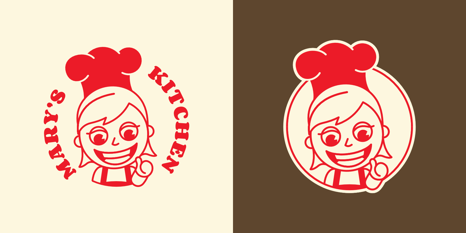
When the owners approached me for a logo, they wanted something fun and classic that reflected the soul of their diner. A unique part of the project was incorporating a sketch made by their son, which served as the inspiration for the diner’s mascot, AKA Mary.
Cooking It Up
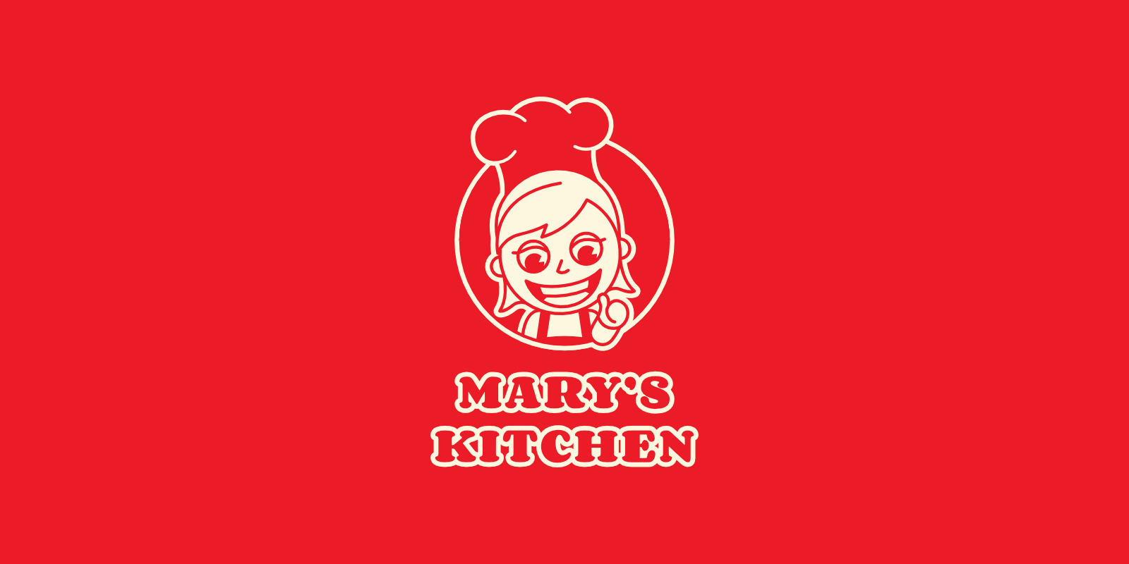
I used his sketch as the foundation, refining the lines while keeping its original charm and character. The result was Mary, the cheerful, welcoming face of the diner.
The color palette was carefully chosen to reflect the essence of the diner and the love that goes into every dish: red for the passion and care that Mary’s Kitchen puts into its cooking, cream for the softness and warmth of fresh bread and buttery pastries, and brown for rich coffee as a grounding accent.
From the hand-drawn mascot to the meaningful color choices, the branding was designed to capture the personality of Mary’s Kitchen: heartfelt, nostalgic, and lovingly made, just like the food they serve.